import numpy as np
import matplotlib.pyplot as plt
📌 Matplotlib
-Python과 Numpy에서 plotting을 위해 사용되며 주로 2D 도표를 위한 desktop package
-IPython과 통합하여 과학 계산 컴퓨팅을 위한 다양한 기능 구축
-IPython, GUI toolkit을 maplotlib를 사용하면 대화형 기능도 구축 가능
x = np.arange(10)
plt.plot(x)
#plt.plot(a)라고 할 때 x축은 a의 index이며 y축은 a의 요소값

x = np.arange(10)
y = x ** 2
plt.plot(x, y)
#결과로 2차 곡선이 나오게 됨
📌 plot을 그릴 시 스타일 지정 가능
| 문자 | 색상 | 마커 | 모양 |
| b | Blue | o | Circle |
| g | Green | IV | Triangle down |
| r | Red | ^ | Triangle up |
| c | Cyan | s | Square |
| m | Margenta | + | Plus |
| y | Yellow | - | 실선 (*2 점선) |
| k | Black | . | Point |
| w | White |
plt.plot(x, y, style)
#style에 다양하게 본인이 원하는 스타일 지정 가능


#1
x = np.arange(10)
plt.plot(x, x*2, 'b-', x, x**2, 'r--', x, x**3, 'go')
#2
x = np.arange(10)

plt.plot(x, x*2, 'b-')
#x*2는 'b' blue로  '-'실선으로

plt.plot(x, x**2, 'r--')
#x**2는 'r' red로  '--'점선으로

plt.plot(x, x**3, 'go')
#x**3는 'g' green으로  'o'circle로


--> 위의 1과 2 모두 같은 결과가 나오게 됨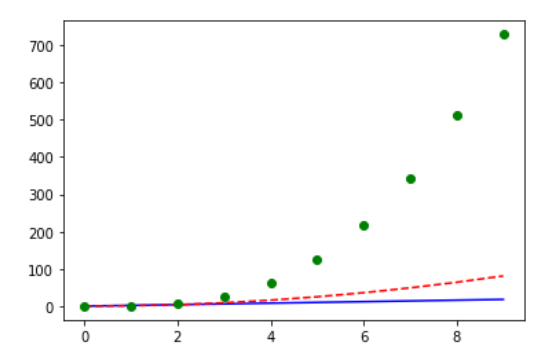
plt.figure(figsize=(5,4))  #figure 크기 결정
plt.plot(x, x*2, 'b-', x, x**2, 'r--', x, x**3, 'go')
plt.xticks(fontsize=12) #x축 숫자 fontsize 결정
plt.yticks(fontsize=12) #y축 숫자 fontsize 결정
plt.xlabel("money", fontsize=16) #x축 label fontsize 결정
plt.ylabel("time", fontsize=16) #y축 label fontsize 결정
plt.title("time for money", fontsize=18, c='r', fontweight=1000) #title fontsize, fontcolor, fontweight
plt.show()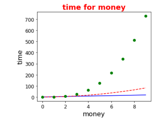
❓figure를 먼저 정하지 않는다면? 원하는 대로 네모 박스가 깔끔하게 나오지 않는 경우가 있기에 figure 먼저 설정
#Limitation 전체 데이터 중 특정 영역만 표시
plt.xlim(min,max)
plt.ylim(min,max)


#Legent(범례)
#plt.legend(loc) 이며 loc에는 'upper left''upper center''upper right'...

x = np.arange(10)
y = x ** 2
y2 = x*5 + 2
plt.plot(x, y, 'b', label='first')
plt.plot(x, y2, 'r', label='second')
plt.legend(loc='upper right')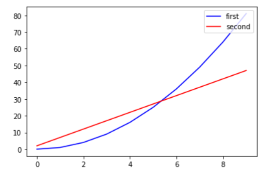
#Annotation 화살표 그리기 적용도 가능
x = np.arange(10)
y = x ** 2

plt.plot(x, y)


#화살표 color와 문구, 위치 모두 조작 가능
plt.annotate('here', xy=(4, 16),
             xytext=(5,20),
             arrowprops={'color':'green'})

plt.text(7, 70, '$y=x^2$')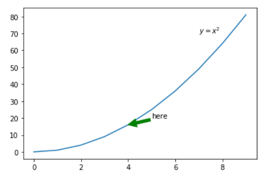
#Subplot 여러 plot을 나누어 표시 가능
#plt.subplot(row, col, idx)

x = np.arange(10)
plt.subplot(2, 2, 1)
plt.plot(x, x**2)
plt.subplot(2, 2, 2)
plt.plot(x, x*5)
plt.subplot(223)
plt.plot(x, np.sin(x))
plt.subplot(224)
plt.plot(x, np.cos(x))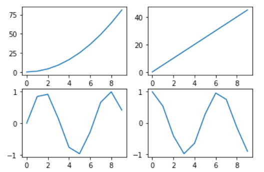
np.random.randn(50)
# 평균 0, 표준편차 1인 표준 정규 분포에서 임의의 숫자 50개 sampling
np.random.randint(1, 100, 50)
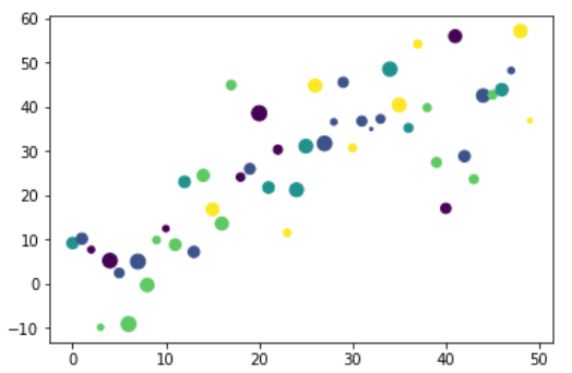
# 1이상 100미만 정수를 랜덤하게 50개 sampling (100은 미포함)#Scatter Plot 산점도, 산포도, 분산형 차트
#plt.scatter(x,y,s,c,alpha) -> s:scale, c:color, alpha:투명도(0-1)
x = np.arange(50)
y = x+np.random.randn(50) * 10
magnitude = np.random.randint(1, 100, 50)
category = np.random.randint(0, 5, 50)
plt.scatter(x, y, s=magnitude, c=category, alpha=0.7)👉 코드를 찬찬히 뜯어보면,
x는 임의의 숫자 50개 sampling, y는 x에 임의의 숫자*10 을 더한 또 다른 임의의 숫자 50개 sampling
magnitude는 1과 100미만의 숫자 중 정수 int sampling이며
category는 0과 5미만의 숫자 중 정수 int sampling이다
scale : 아래 예시의 동그라미, 즉 마커의 크기를 의미한다
color : 아래 예시의 동그라미의 색상을 의미한다
#Bar 그래프
#plt.bar(x,y) // plt.barh(x,y) 세로그래프 혹은 가로그래프

names = ['A', 'B', 'C']
values = [50, 30, 100]
plt.subplot(1, 2, 1)
plt.bar(names, values)
plt.subplot(1, 2, 2)
plt.barh(names, values)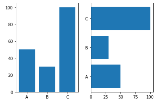
#히스토그램
#n, bins, patches = plt.hist(x, bins, range)
#x:데이터, bins:계급, range:대상범위, n:도수, patches:계급 별 히스토그램 좌표와 높이

x = 100 + 15 * np.random.randn(10000)
n, bins, patches = plt.hist(x, 50)    #맨 마지막 50이라는 숫자가 커지면 커질수록 세밀한 히스토그램 나옴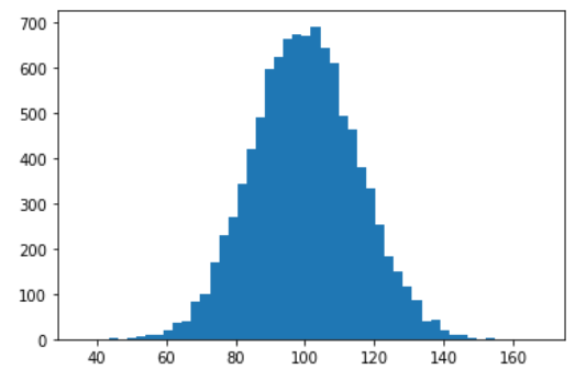
'CDS' 카테고리의 다른 글
| Machine Learning [K-NN] (0) | 2021.11.15 |
|---|---|
| Machine Learning [Scikit-Learn] (0) | 2021.11.15 |
| Machine Learning Overview (0) | 2021.11.15 |
| Data Visulization : Seaborn(데이터 시각화) (0) | 2021.11.12 |
| EDA (Exploratory Data Analysis) (0) | 2021.11.12 |